这节内容,紧接着上一篇HTML入门 ,我们介绍Css进阶相关知识点
Css是什么?
css为了美化页面的一套浏览器语法规则,
Css是由CSS Working Group负责制定的. 这个工作组有不同浏览器厂商代表、其他公司中对css感兴趣的人以及一些受邀请的专家组成。
由此,我们就可以看出,css需要浏览器厂商去实现。这样就存在时间差、实现差,进而存在了兼容性问题
Css为何要出现?
浏览器渲染Html元素,展示的内容都是黑色、固定大小,不能做到丰富多彩,我们希望的是,可以跟印刷一样,多彩好看。
Css结构
优先级,从高到底
行内样式 1 2 3 4 5 6 7 8 9 10 11 <!DOCTYPE html> <html> <head> <meta charset="utf-8"> <title>My CSS experiment</title> </head> <body> <h1 style="color: blue;background-color: yellow;border: 1px solid black;">Hello World!</h1> <p style="color:red;">This is my first CSS example</p> </body> </html>
html内css 1 2 3 4 5 6 7 8 9 10 11 12 13 14 15 16 17 18 19 20 21 22 <!DOCTYPE html> <html> <head> <meta charset="utf-8"> <title>My CSS experiment</title> <style> h1 { color: blue; background-color: yellow; border: 1px solid black; } p { color: red; } </style> </head> <body> <h1>Hello World!</h1> <p>This is my first CSS example</p> </body> </html>
外部文件css 1 2 3 4 5 6 7 8 9 10 11 12 13 14 15 16 17 18 19 20 21 22 23 24 #html <!DOCTYPE html> <html> <head> <meta charset="utf-8"> <title>My CSS experiment</title> <link rel="stylesheet" href="styles.css"> </head> <body> <h1>Hello World!</h1> <p>This is my first CSS example</p> </body> </html> #css h1 { color: blue; background-color: yellow; border: 1px solid black; } p { color: red; }
Css开发要点 内置函数的调用 1 2 3 4 5 6 7 .box { margin: 30px; width: 100px; height: 100px; background-color: rebeccapurple; transform: rotate(0.8turn) }
媒介查询 1 2 3 4 5 @media (min-width: 30em) { body { background-color: blue; } }
添加注释 1 2 3 4 5 6 /* Handle specific elements nested in the DOM */ /* -------------------------------------------------------------------------------------------- */ div p, #id:first-line { background-color: red; border-radius: 3px; }
缩写 1 2 3 4 5 6 padding: 10px 15px 15px 5px; 等效于 padding-top: 10px; padding-right: 15px; padding-bottom: 15px; padding-left: 5px;
CSS @RULE
charset, 标识css文件采用的编码
1 2 # 只能用于css文件,style属性、标签均无效 @charset "utf-8";
引用其他css文件
设置命名空间
1 2 3 @namespace url(http://www.w3.org/1999/xhtml); @namespace svg url(http://www.w3.org/2000/svg);
support 与 media
1 2 3 4 5 6 @supports (display: flex) { @media screen and (min-width: 900px) { article { display: flex; } }
document,限定到特定的url.
1 2 3 4 5 6 # 仅仅firefox支持 @document url("https://www.example.com/") { h1 { color: green; } }
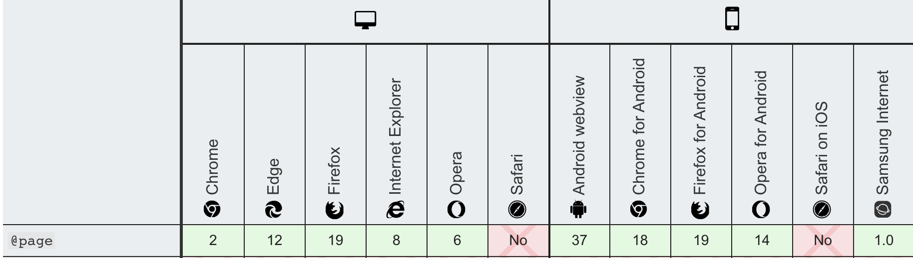
page,打印的时候,修改部分css样式
1 2 3 4 5 6 7 @page { margin: 1cm; } @page :first { margin: 2cm; }
使用特定字体
1 2 3 4 5 @font-face { font-family: "Open Sans"; src: url("/fonts/OpenSans-Regular-webfont.woff2") format("woff2"), url("/fonts/OpenSans-Regular-webfont.woff") format("woff"); }
定义css动画帧
1 2 3 4 5 6 7 8 9 @keyframes slidein { from { transform: translateX(0%); } to { transform: translateX(100%); } }
viewport
1 2 3 4 5 6 7 #已废弃 @viewport { width: 100vw; /*Sets the width of the actual viewport to the device width*/ } # 改用html中 <meta name="viewport">
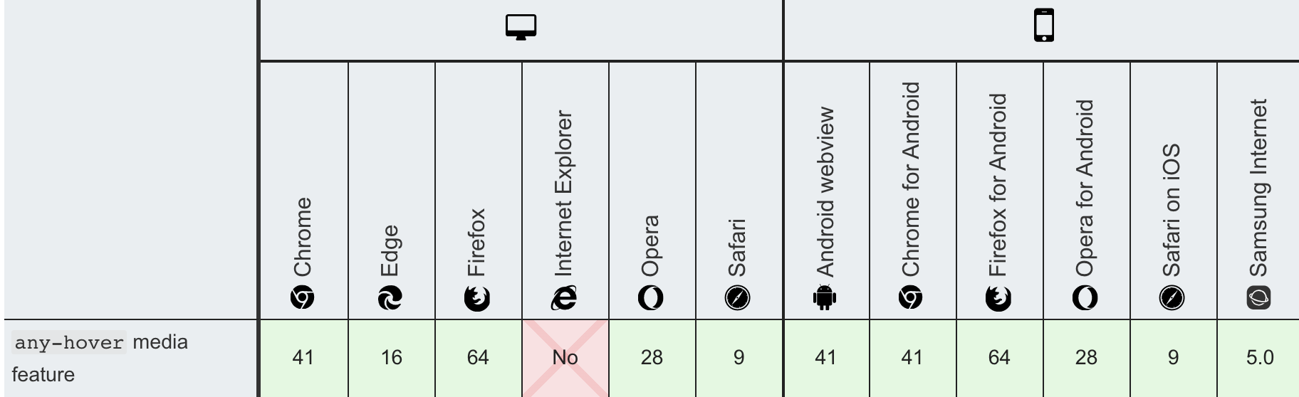
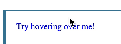
统一修改hover效果
1 2 3 4 5 6 7 8 9 10 11 12 13 14 15 16 17 18 #html <a href="#">Try hovering over me!</a> #css @media (any-hover: hover) { a:hover { background: yellow; } } # 类似hover @media (hover: hover) { a:hover { background: yellow; } }
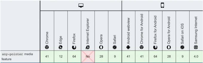
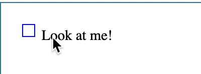
设置鼠标操作效果
1 2 3 4 5 6 7 8 9 10 11 12 13 14 15 16 17 18 19 20 21 22 23 24 25 26 27 28 29 30 # html <input id="test" type="checkbox" /> <label for="test">Look at me!</label> #css input[type="checkbox"]:checked { background: gray; } @media (any-pointer: fine) { input[type="checkbox"] { -moz-appearance: none; -webkit-appearance: none; appearance: none; width: 15px; height: 15px; border: 1px solid blue; } } @media (any-pointer: coarse) { input[type="checkbox"] { -moz-appearance: none; -webkit-appearance: none; appearance: none; width: 30px; height: 30px; border: 2px solid red; } }
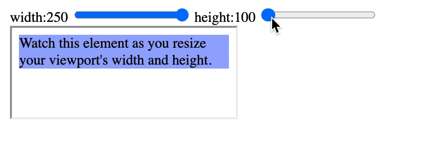
根据viewpoint宽高比,设置不同css
1 2 3 4 5 6 7 8 9 10 11 12 13 14 15 16 17 18 19 20 21 22 23 #html <div id='inner'> Watch this element as you resize your viewport's width and height. </div> #css @media (min-aspect-ratio: 8/5) { div { background: #9af; /* blue */ } } @media (max-aspect-ratio: 3/2) { div { background: #9ff; /* cyan */ } } @media (aspect-ratio: 1/1) { div { background: #f9a; /* red */ } }
height
根据高度设置不同css
1 2 3 4 5 6 7 8 9 10 11 12 13 14 15 16 17 #html div>Watch this element as you resize your viewport's height.</div> #css html{ font-size:16px; } @media (min-height: 20rem) { div { background: yellow; } } @media (max-height: 30rem) { div { background: red; } }
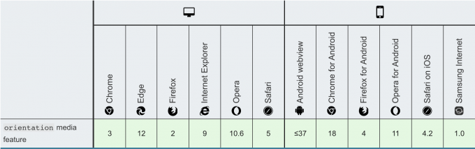
横屏、竖屏样式设置
1 2 3 4 5 6 7 8 9 10 11 12 13 14 15 16 17 18 19 20 21 22 23 24 25 #html <div>Box 1</div> <div>Box 2</div> <div>Box 3</div> #css body { display: flex; } div { background: yellow; } @media (orientation: landscape) { body { flex-direction: row; } } @media (orientation: portrait) { body { flex-direction: column; } }
prefers-color-scheme
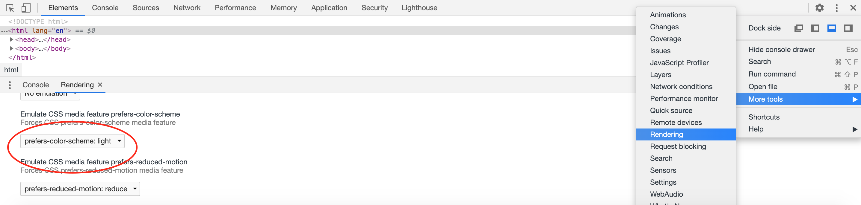
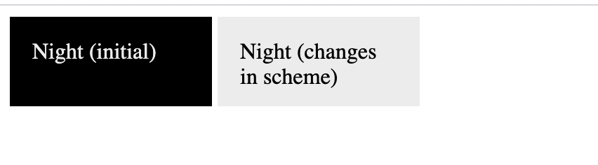
暗黑模式 , 利用chrome的模拟功能触发change,加载不同的css样式
1 2 3 4 5 6 7 8 9 10 11 12 13 14 15 16 17 18 19 20 21 22 #html <div class="night">Night (initial)</div> <div class="night night-scheme">Night (changes in scheme)</div> #css .night { background: black; color: #eee; } @media (prefers-color-scheme: dark) { .night.night-scheme { background: black; color: #eee; } } @media (prefers-color-scheme: light) { .night.night-scheme { background: #eee; color: black; } } .night { display: inline-block; padding: 1em; width: 7em; height: 2em; vertical-align: middle; }
1 2 3 4 5 6 7 8 9 10 11 12 13 14 15 16 17 18 19 20 21 22 #html <div>Watch this element as you resize your viewport's width.</div> #css @media (width: 360px) { div { color: red; } } @media (min-width: 35rem) { div { background: yellow; } } @media (max-width: 50rem) { div { border: 2px solid blue; } }
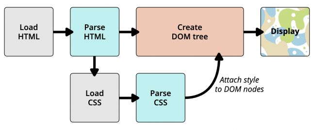
Css如何生效的
1.HTML解析为对应的DOM
2.浏览器解析Css,并根据选择器,使用优先级、继承等规则,决定选择器应该设置哪些样式
3.然后把对应整合后的css样式,设置到Dom对象上
4.交给浏览器绘制渲染展示
参考 